Thursday, December 24, 2015

I Come To Carve Caesar, Not To Bury Him

What do you get for a foodie Classics professor?

I dunno. Maybe a new tie or something.

Or maybe something else. I had to make something for someone this year, what with all the technology I've got kicking around now. The recipient ended up being the older brother. Something I've wanted to do is to make a Caesar-shaped knife block so you can stab him in the back every time you put your knives away. However, the best possible design, with a fully 3d Caesar, requires a 360-degree scan of a statue or something similar, and I don't have that. And at any rate, I'd need to do the design in chunks with the 3d printer. So I'm falling back on something simpler.

The body of this thing is several sections of birch plywood with 1/8" grooves of various widths routed diagonally through it. One was made with the CNC machine, the other with a router. Not sure which method I prefer. I get more control with the CNC, but working with the router doesn't take too long and doesn't tie up my computer for hours at a time.


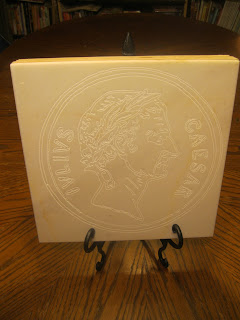
The face is a piece of marble floor tile I got at the hardware store for about a buck per square foot. The design comes from an old coin. It's engraved using a v-bit and cuts a mere 0.02" into the tile. Came out rather nicely, I think.


Once all the pieces were made, it was easy to glue all the wood bits together, sand them down, and attach the marble with some all-purpose construction adhesive. Knives fit into the grooves in opposite directions, and with the stand, it really puts the "stab" into "stabat."


Wednesday, December 23, 2015

Merry Steampunked Cookie Season

Remember the Heaven and Earth Lamp? OK, probably not. I do, though. I got the biomass portion of it spruced up for the holidays.


Saturday, December 5, 2015

In Which 3d Printing Saves Christmas

Certain persons I am married to have a nativity set to which there is considerable sentimental value attached.

 If it looks a bit worn, it's because it's probably older than anyone reading this. Possibly their parents. Maybe their grandparents. It was a wedding gift to Stephanie's grandparents when they got married, the same day the Americans and Filipinos recaptured Manila from the Japanese.

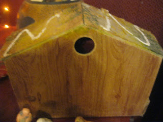
The barn/animal shelter part of the set has a little hole in the back where a light can be put in and shine through the star-shaped opening in front, for the better guidance of a trio of either monarchs or Zoroastrians.


In past generations, they'd used a cord with a single Christmas tree light to light it up, but in the 21st century, I figured it was time for something better. By which I mean, of course, time to throw vastly too much technology at the problem.

We had some battery powered tea lights kicking around, which seemed about right, but how to get one to shine through the hole? My first thought was to make a tall stand for the light with the 3d printer. However, that turned out to be just slightly bigger than the largest dimension my printer could handle, so I had to rethink the design. What I settled on was a holder for the tea light with a little clip on the front so that it could hang on the edge of the hole. It's ultimately a better design, since it uses far less material than the freestanding approach would have.


Turn it on, and you get the warm flickering glow of a far-off nova shining on a bunch of plaster figures.


So merry cookie season, everyone!

Sunday, October 25, 2015

Art Deco Switch Plate

Every since we moved into this house, over a decade ago, we've had the dull old plastic switch plate which was here before us. With the 3d printer, we can't very well have that, now, can we? However, unlike the Doors of Durin in the dining room, certain persons I'm married to wanted something better fitting the age of the house (constructed in 1930). I dug up some art deco designs and went through the usual process to turn that into a 3d shape, then superimposed that on a two-gang switch plate design.


The material for this one was a very different color, but I was lucky to find a can of spray paint in almost the exact same color we'd painted the wall when we moved in. To get the gold on the raised portion, I put a thin layer of gold paint on a piece of foil and pressed the switch plate against it, getting gold on the raised portion. I think it came out pretty well, looking a bit aged but matching the room's gold-and-red color scheme.


Tuesday, October 20, 2015

Monster Tokens

For anyone interested, I've posted files for basic monster tokens for Castle Panic. Not much in themselves, but they can be combined with monster shapes for DIY miniatures.

Friday, October 2, 2015

Monsters, Monsters

We don't (yet) have a true long-term solution to the wear and tear we put on our Castle Panic monster tokens, but I've got a possible one. The Wizard's Tower expansion introduced the idea of placeholder tokens. The big monsters get triangle tokens to be put in the bag with the others for random drawing, and when they're selected, they're replaced on the board by the real tokens, which are other shapes (pentagons for the 5-point dragon and chimera, for example).

So, then, with a little 3d printing, I can extend the idea to just about all the monsters. I worked up a basic token-shaped template, made versions with different sets of numbers (every range from just 1 up to 1-4), and started to combine them with various monster models downloaded from Thingiverse. Some of the monsters I've found are big enough to cause problems with my underpowered computer, but there are a bunch of miniatures games which provide very useful critters.

Here, for example, is an ogre:


And here's a troll:


The nifty thing about the troll is that a fire token fits on his axe:


I've only done a few so far (troll, ogre, and goblin cavalry), but eventually, I can probably get enough to replace all of the monsters.


Sunday, September 20, 2015

Have I Mentioned We Play A Lot Of Castle Panic?


We do. A lot. To the point where we've had to order replacement cards when our first deck became unusable, and we've just ordered replacement tokens, which are largely illegible now. We use 3d printed walls and towers because the cardboard ones are falling apart. The board is also a mess, and has long been held together with tape. I've been working on a solution for that, and it's finally ready. This one combines work with the CNC machine with the 3d printer in one big and hopefully durable last-Castle-Panic-board-we'll-ever-need.

With a 22" diameter, that's 380 square inches of monster-killing territory.

The board is made from six wedges of half-inch birch plywood. I used a V-bit to inscribe the ranges and arcs, then switched to a standard 1/8" bit to do the deeper cutting. Each wedge is colored with an appropriate stain all the way out to the forest ring, which is useful because the green background color all away around at that range was sometimes confusing.


To hold the wedges together, the CNC machine cut out half-butterfly shapes at the edges of the forest and castle rings. The shape can then be clamped with a 3d-printed part, holding it securely (a technique which goes back a long way; my Classical education proves useful for something!).


Each forest-ring clamp has its own decorative bit, such as the fanged skull and ruined tower here. The castle-ring clamps are flat, since decorations would interfere with the all-important walls and towers. For the numbers associated with each individual arc, a quarter-inch hole at the outside of the forest ring fits a 3d-printed peg with a number on it.


A ruined temple (using the mineral filament) and weird Aztec-looking tower (regular filament, just painted) here. We've been using the monster-themed cups to hold dead tokens for a while now.


Stone-textured fanged skull and capital here (again, regular PLA filament, just painted).

And when the game is finished, we can take out the clamps, stack up the board wedges, and put them away somewhere until next time.

Still no similar long-term solution to the worn tokens; this may not be the last time we reorder. However, between the Bocusini and the Pancakebot we've got on order, we've got some ideas about very, very short-term solutions.


Friday, August 28, 2015

Doors of Durin Addendum

I had another go at the Doors of Durin switchplate with some modest tweaks to the print settings. As hoped for, I got less stringing (and therefore less cleanup after the fact) and less curving on the printing plate. And I hit it with some stone-texture paint before the glow layer. Yes, much better.


Sunday, August 23, 2015

Speak Friend And Enter

 There has been a much-deserved to-do of late about these Frankenstein-style knife switches. They're lovely and I've run one off for one of our rooms, but between several other decorative switch plates we've already got and a limited number of suitably placed standard-switch switches in the house, I can't find a lot of places to put them. For example, in the dining room, we've got a rocker switch rather than a standard one. So what to do? Well, make my own, obviously.

The large open area necessary for the rocker switch suggested a spot suitable for an arch or doorway sort of motif which, being who I am, led to an obvious conclusion. I combined somebody else's slide-rocker switch plate design with an image which I ran through the same extruding process I use for cookie cutters and got this:


The Doors of Durin plate wasn't too difficult to design. The image is readily available and the process is, for me, well defined by now. There were some adjustments to make to the design, shoving the crown and anvil up a bit and removing some free-standing bits of the design out of the way because they take up room where the switch is supposed to be. The design is also complex enough that it strained the capabilities of my hardware. I could make a change and then come back five minutes later to see it take effect.

The print was more difficult. The plate is about as large an area as my printer can handle, so the usual tricks to prevent curling don't work well. I switched from a brim (no room around the edges) to a raft which sorta worked, but the raft curled enough to make it difficult to smush it into the underside of the plate, so it was difficult to remove in spots. Also, I somehow turned off retraction, so I had a lot of stringing to clean up. Still, seems to have worked OK.

Oh, and there was one other bit of post-processing I just had to do. It glows in starlight, right? Well...


Thank you, glow-in-the-dark paint.


Sunday, July 5, 2015

Another Retro Table

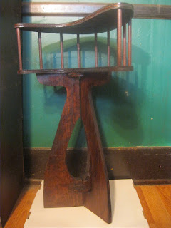
Now that we've got the retro coffee table in place, we developed a need for an end table which didn't clash. I started looking around for mid-century designs and liked the two-level design of this table:

I did not, however, feel that I needed to duplicate the $999 price tag. I also wanted to do something different with the legs, and was struck by the in-and-back-out curves of that mid-century icon, the Space Needle.

This was almost absurdly easy once I had the idea down. I got a basic boomerang shape in Inkscape, added 3/8" circles at intervals around the edges, and made a horizontally flipped copy. I used the Shapeoko to cut the table pieces out of half-inch birch, with pocket operations to drill the 3/8" holes down a quarter inch. Again, the fit I can get is very pleasing; the dowels connecting the two levels fit into the holes snugly, barely needing glue. The legs were just a question of a few sweeping curves cut into some planks, with notches matching similar grooves cut out of a few circles holding them together. Stain, glue, a few layers of poly, and it's the Jetsons' house:


And I think the total I spent on making the table, including buying the CNC machine, is less than what they're selling the original table for.

Saturday, June 20, 2015

Super Block

Not long ago, I saw this hoplite-themed knife block:

(from here)


And I thought "Hey, that'd be a nice, easy project for the CNC machine." But in deference to my lovely and talented spouse's sensibilities, I decided a different theme was in order. And it was far too easy.

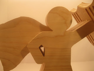
I found some superhero-shaped silhouettes, played with them a little in GIMP to make suitable outlines, ran them through Inkscape, and handed the designs to the Shapeoko, using a 1/8" bit and 3/4" birch plywood. Here's what I ended up with:


The edges came out quite nicely. A little work with 300-grit sandpaper cleared up some fuzziness and some splinters. The caped body piece gets sandwiched between the non-cape bodies and has small pegs which are supposed to fit into the holes in the base and shield/knife-holder. This is how it looks glued together.


The tolerances are rather stunning. The "foot" and "hand" pegs fit almost perfectly, requiring a bit of force to get them in and holding so well they almost didn't need glue. The Shapeoko is too much fun, and I've only been using it a couple of weeks.


Saturday, June 13, 2015

Scaling Up

The dragon I posted yesterday was maybe three inches across. This one isn't.


Ruler for scale. Obviously.

I'm still feeling my way around what bits to use under what circumstances, and I really need to work on hold-downs, but the CNC machine is doing whatever I tell it to, no matter the size.


Thursday, June 11, 2015

Fully Functional


I did a little tightening up here and a little adjusting there and...


Yep. Machine works. No sign of that drifting to the left. I've got some other prep work to do like putting threaded inserts into the waste board to make it easier to clamp pieces down, but I've basically got it functioning like it should. I'm running a larger-scale test, but after that, on to the inlay work.


Tuesday, June 9, 2015

First Carve

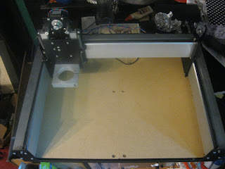
I managed to clean out a corner of the garage so I could run the CNC machine without filling my dining room with sawdust and noise. Watching it work is insanely cool.


But how does it work? Well, needs a little tuning. There's a bit of leftward stepping going on with the finished test piece, which suggests I'm losing some moves along the X axis. Probably just need to tighten up some pieces.


But I've finally got the machine plugged in and running. Now I can reasonably contemplate cranking out wooden pieces for Castle Panic, engraved stone, inlaid furniture for Stephanie, and all manner of things.


Saturday, June 6, 2015

Shapeoko 3, #90


Now witness the firepower of this fully ARMED and OPERATIONAL battle station!


 OK, maybe not quite so impressive as all that, but at this point, I have a fully assembled CNC machine which is responding to controller software commands and gcode files. Now, what shall I make first?

Sunday, May 24, 2015

Tabula Rasa

For some time, Stephanie's been wanting something like a coffee table for the living room to use instead of a series of tiny folding tables which get moved into and out of the room as necessary. After, at long last, looking at the design of some mid-century modern tables, I realized that building such a thing would be remarkably easy. And it was.

Table, with dog for scale.

I started with a couple of sheets of plywood (a thin birch piece for the surface, a thicker pine one for the underside). I scribed a triangle on the surface, used a couple of old paint cans to draw curves into the corners, clamped them together, and cut out the shape with the usual jig saw.

Using a little simple geometry, I found the center of the triangle constituting the lower piece, drew some lines out from there towards the corners, and put the brackets for the legs about two thirds of the way out from the center towards each corner. I used angled brackets for the legs, and cut the ends of the legs at a matching ten-degree angle. Doing the top and bottom as separate pieces conveniently allowed me to drill through the bottom piece without worrying about marring the top.

Once that was done, I glued the top and bottom parts together (clamped together for about a day), put iron-on birch trim around the edges and trimmed it back, stained it a reddish-brown (sorta mirroring the living room's largely red color scheme), and put on lots and lots of coats of polyurethane finish, occasionally sanding between coats.


Helpful scale dog provides scale.

The result is, it appears, a nicely stylish table, sized and colored to suit the room it's in, which cost maybe $75, with the manufactured legs and brackets being the most expensive components. Once I get the CNC mill going, I may experiment with smaller side tables in the same style, but with some Atomic Age inlay.


Thursday, April 2, 2015

Brick. Or stone. Or chalk. Or something.

OK, one more exotic material. Laybrick isn't, despite the name, brick-based. Rather, it's a composite of plastic and chalk dust, and is marketed as providing a sort of stone-like appearance. And it kind of does. The surface doesn't have the gloss of plastic or the metallic sheen of the copper and bronze filaments I've played with. Rather, it's got a faintly porous, matte surface like unpolished white limestone or perhaps a ceramic. However, what I thought it most resembled was bone. So:


It prints very smoothly, certainly. It's very difficult to see any kind of grain in this, even close up. There were some issues with the top layer and the protruding spikes, but I suspect that's up to my printer settings, since that sometimes happens with other filaments I use as well.

One of the advertised properties of this material is that it provides different textures depending on the temperature at which it prints. Cooler is smoother, hotter is rougher. I attempted printing an object with the same temperature-varying plug-in I used to print the wood pieces. The results weren't as impressive. There were striations, but they weren't particularly visible. I may try again with a greater temperature range.


Sunday, March 15, 2015

Wood


One last experimental filament: wood. This filament is a mixture of plastic and fine-grained wood fibers, alleged to produce a wood-like look and feel. Sounded fun, so I ordered a small roll. Long story short: not bad.


The first bit of difficulty with this is that it comes loosely coiled in a bag, secured with a zip-tie, rather than on a spool like other filaments. I think it's because the filament is relatively brittle, so it can't be wound as tightly. OK, but how do you put it on the printer? You could cut off the zip-tie and put it on a spool holder, but you run the risk of it uncoiling all over the place. What I did in the short term was to loosely coil some of it around an empty spool and print from there, putting the main coil back in the bag until it's needed. So far, seems to work all right.

The second potential problem is one I'd been forewarned about, so I was able to get out ahead of it. Word on the street is that the fibers in the filament cause clogging. I replaced the usual 0.4mm nozzle on my printer with an 0.75mm one, and I had no clogging issues at all.

Printing was a little iffy because adhesion seems inconsistent. On my first print, the tall, skinny item I was printing broke off about a quarter of the way up when I pulled it off the plate; the bottom of the piece was stuck to the printing surface more strongly than some of the layers farther up were to each other. On a later print, some of the support material didn't stick at all well to the plate, so the piece came loose and didn't finish successfully. Printing seems to be best on blockier pieces which have a lot of surface area touching the plate.

The filament itself doesn't look all that woody once printing is complete. It's a matte brown which certainly is a wood-like color, and the texture is, indeed somewhere between plastic and wood, but it's not, in itself, all that convincingly woody. It's most like a sort of really thick, dense cardstock. However, here's where another of the wood filament's properties comes in to play. The precise color is sensitive to printing temperature. Higher temps darken the wood fibers. And as it happens, there's a plugin for Cura which takes advantage of this very property. The temperature of the hot end changes during printing, creating light and dark bands, emulating wood grain, and I think that works pretty well. For another piece, I'm considering using a bit of stain and shellac.

So now that I've got that printed out, I thought I'd take stock of where our Castle Panic  set is now. At this point, the walls and most of the towers are stone-painted pieces. The wizard's tower is copper with heavy natural patina. I've also got custom pieces for tar, some painted flame tokens, a monster-themed cup we keep the dead monsters in, and a one-piece dice tower which has nothing to do with Castle Panic, but we use it anyway. At the rate we make new pieces, and at the rate the original set is wearing out from heavy use, I may end up rebuilding the whole game.


Thursday, March 5, 2015

Metal!

I recently became aware of some exotic new materials for 3d printing. Notably, I've come across some materials by colorFabb. They're playing with a number of unusual things, but the ones I'm dealing with right now are their copper and bronze filaments. These aren't just colored. They're PLA filament with a substantial addition of copper and bronze powders. The ideas is that with appropriate treatment, they look for-real metallic. So how do they work?

They print quite well in my quick tests, sticking to the usual blue-tape-and-hairspray surface I usually use as well as any PLA with no noticeable warping. The marketing material indicates that the metal content means that they cool faster than regular filament, so they're particularly good for pieces with overhangs. I haven't done anything with exaggerated overhanging material yet, but it at least sounds plausible.

The printed material seems a bit fragile. It doesn't fall apart if you breathe on it wrong, but it does break more readily than 100% PLA. But the big difference I noticed was the weight. Not surprisingly, the metal-bearing filament is a lot heavier. It's not as heavy as an all-metal item would be, but there's definitely some heft. It also feels a bit cool to the touch, a bit like something metallic would.

However, they don't come out looking like metal. The bronze comes out as a sort of sandy light yellowish brown while the copper comes out a red which is definitely in the copper color range, but neither appears metallic.


That's where the post-processing comes in. The first step is to sand the surface of the print smooth, optionally hit it lightly with a little black paint to create the illusion of a dark patina, and finally rub with a brass polish.


(That bit on the right is a late Warring States-era dagger axe, the first in a series of historically accurate polearm hair sticks I'm making for Stephanie.)

So far, it's coming out OK, but not great. I'm getting a definite metallic sheen, which is definitely understated in the photo but still not all that impressive. Clearly, I need a better sanding and buffing technique. I've seen a Dremel used with some buffing heads, but in my tests, I've been gouging the plastic pretty badly with it. However, the steel wool I'm using isn't getting outstanding results. Finely detailed pieces are also a problem. I'm having a difficult time with all the corners and little protrusions. I gave up on the retro spaceship from the first picture and printed a little sword in the copper to see if that would work better. There is one interesting thing, though: within a few minutes, the bronze head on the dagger axe was already developing a pale green patina. So, yeah, actual metal.

That's nifty, but there's one other notable thing about this filament. It's expensive. It's really expensive. It costs significantly more by weight than regular PLA, and it's much denser, so the same weight gets you a fraction as much length. All told, it's more than an order of magnitude costlier than plain PLA on a meter-by-meter basis. So it's neat for specific artistic effects, but run test prints with cheaper stuff first to make sure they're absolutely perfect. Mistakes with the metal-bearing filament are costly.

Wednesday, February 18, 2015

A Tale of Two Hexes

As a long-time gamer, I've played and continue to be involved in games which use hex maps, going back to Squad Leader and other Avalon Hill products. One of the earliest such games I played with the Metagaming/Steve Jackson classic Ogre, for which I've already done a bit of printyness. Having 3d cybertanks ready to roll is great, but what about the other units? The internet being what it is, somebody's already way ahead of me. The units are great, but can I add anything to that? Nifty as they look, they're missing something important for actual game play: stats. But that's easily dealt with. Whip up a hexagon of the appropriate size, extrude it into a suitable thickness, add a little 3d text around the edges, and drop the unit miniature in the middle.

One of the other games I'm into is the likewise Steve Jacksony RPG GURPS, which likewise uses a hex grid to regulate movement. Here, again, the internet's got my back, with these lovely floor tiles which could be used to build nice dungeons. All I have to do is to add some hexes, as in this test piece.


The problem here, though, is one which has plagued gaming map-makers for decades. People tend to build in rectangles, but maps are in hexes. The source tiles I'm working with are naturally in various sizes of squares and rectangles, and while I can lay down a hex grid of whatever kind I want on top of a batch of tiles, I have to decide between making either a geomorphic hex grid which doesn't make sensibly shaped rooms or a geomorphic square grid which ends up with a bunch of not-quite-hex-shapes around edges. Oh, well.